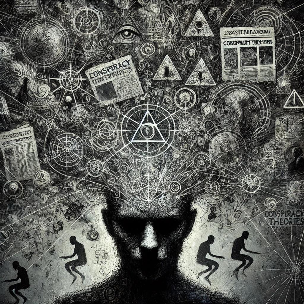
Decoding the Web of Belief
There are no facts, only interpretations.
“There are no facts, only interpretations.”
— Friedrich Nietzsche
Note: I've written this piece to be as non-technical as possible. For my non-technical readers, this piece should contain everything you need to understand the project from start to finish.
For those interested in the technical details, all of the code used to create the graph is located in this code repository. The README file contains instructions for sourcing the data, decompressing it, cleaning it, extracting entities from text using the REBEL model, leveraging your GPU with PyTorch and constructing the graph.
With some slight modifications, the contents in the repository can be used to construct knowledge graphs from any collection of subreddits, or any data source with a similar structure.
Table of Contents
- Conception
- Mapping the Territory
- Where Theories Live
- Harvesting the Data
- Extracting Ideas
- Grounding Knowledge in Reality
- Cartography Meets Psychology
- Analysis of a Collective Conciousness
- Our Voyage Concludes
- Learn More
Conception
During a morning walk in mid-2024, I had a simple thought:
"If you could create a physical map of all conspiracy theories and how they are related, what would it look like?"
At the time, I had just finished research on building knowledge graphs from unstructured data. If it was possible to construct graphs from scientific publications, it seemed reasonable that similar, analytical approaches could work for any unstructured source. Years prior, I attended a talk by Simon DeDeo at an event hosted by the Santa Fe institute. He shared research findings on how humans construct explanations and how those explanations can go wrong. I’ve long been interested in extreme expressions of human behavior: historical tragedies, war, peak physical performance, and non-conformist belief systems. The idea of compiling a map of the most extreme explanations we’ve created about the world fascinated me.
So I set out to build a graph of conspiracy theories, unsure whether the results would be insightful or incoherent, but confident the process itself would be revealing. This project is technical in nature, spanning data engineering, natural language processing, large language models, the mechanics of knowledge graphs, named entity recognition, relation extraction and applied mathematics. I walk through the work end to end, from raw source data to the constructed graph, and then step back to reflect on what, if anything, the structure of the graph reveals.
Mapping the Territory
Before setting out on this journey, it’s important to be clear about the destination. I knew what I wanted to create from the beginning; I just wasn’t sure how well it would work.
I wanted to build a graph. Not a chart, the kind most of us remember from math class, but a graph. The kind of graph used in graph theory, sociology, biology, and other fields. This wasn’t new territory for me; I’d built graphs from unstructured data before in my professional work.
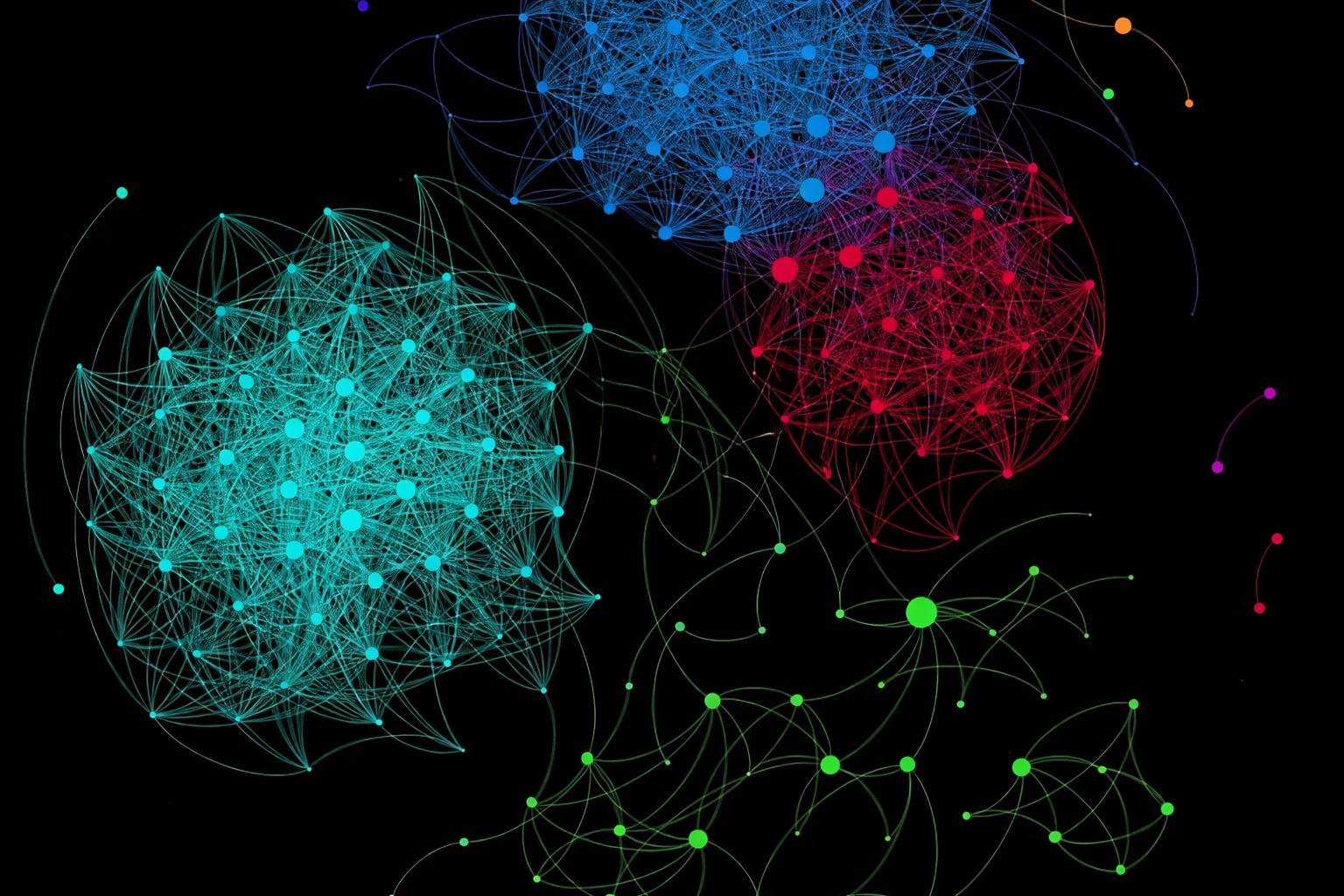
In graph theory, a graph is a structure where objects, called nodes, are connected by edges that represent relationships between them. In our graph, nodes are ideas, edges are the connections between them, and colors represent clusters of related ideas.
At its core, a graph is made up of nodes and edges. Nodes represent things, while edges represent the relationships between those things. In this case, I wanted the nodes to represent ideas, the building blocks of conspiracy theories. These might be things like JFK, the Illuminati, and so on. The edges would describe how those ideas relate to one another, with each relationship assigned a strength ranging from 0 for a very loose connection to 1 for a very strong one.
Finally, I wanted the graph to form clusters of closely related ideas and be color-coded accordingly. For example, a 9/11 cluster might include concepts like jet fuel, George W. Bush, world government, the CIA, and Al-Qaeda.
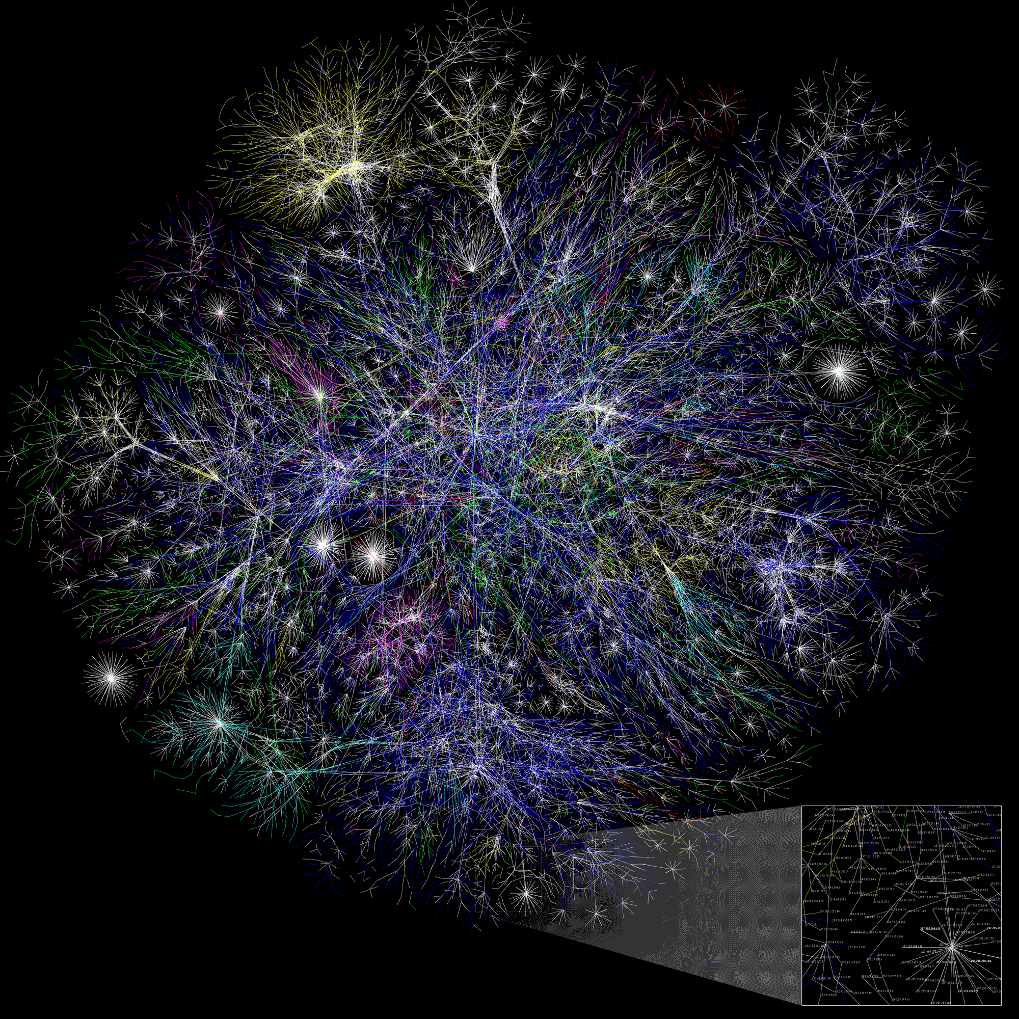
"The Internet Mapping Project, launched at Bell Labs in 1997 by William Cheswick and Hal Burch, visualized the structure of the internet as a graph. For the first time, the shape of the network was visible in a way raw data never could."
A graph like the one shown above can tell us a lot. It can reveal which ideas are most closely related, based on the strength of the connections between them. It can show which ideas are the most central or influential, indicated by nodes with the greatest number of connections. And it can even surface distinct conspiracy theories themselves, emerging naturally as clusters within the graph.
This structure becomes our map, helps us navigate the landscape of ideas, and it’s exactly what we’re trying to build.
Where Theories Live
Conspiracy theories are, at their core, ideas. To map them in the aggregate, those ideas must first be captured and combined in some concrete form. Many philosophers, including Plato, Thomas Hobbes, Hegel, and Wittgenstein, have emphasized the deep entanglement between thought, speech, and writing. If ideas are inseparable from the language that gives them shape, then collecting language becomes a way of collecting thought itself. As Wittgenstein put it in the Tractatus Logico-Philosophicus, “The limits of my language are the limits of my world.”
If we accept the assumption that written text is strongly correlated with thought, then text becomes an ideal substrate for constructing a knowledge graph of conspiracy theories. The task, then, is to assemble a corpus that captures how these ideas are articulated, debated, and refined in the wild.
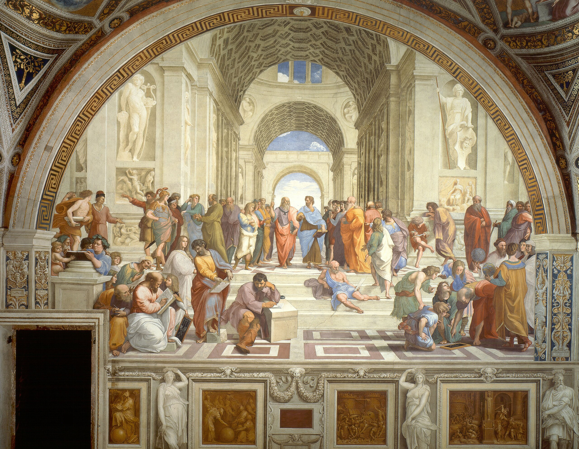
Raphael's School of Athens depicts an idealized space of reasoned debate. What would its subjects make of the fractured discourse that dominates our virtual public squares today?
An effective corpus for this purpose should have three core properties. First, it must be tightly focused on conspiracy theories, with language bounded to the subject to ensure a high signal-to-noise ratio. Second, it should present discourse rather than monologue. It should contain presentation, discussion, and debate that mirror a public square in which claims are proposed, challenged, defended, and elaborated. Finally, the corpus must be both large and temporally broad. The greater the volume of text and the longer the time horizon it spans, the more robust and representative the resulting map becomes.
Reddit satisfies these requirements particularly well. The platform is organized into topic-specific communities called subreddits, each functioning as a loosely defined forum centered on a shared interest. Some subreddits focus on news, others on casual reflection or technical explanation, but all share a common structure: posts followed by threaded discussion. This structure allows discourse to unfold naturally over time, often across many years and millions of contributions.
For conspiracy theories specifically, I selected four subreddits:
- r/conspiracy
- r/conspiracytheories
- r/conspiracy_commons
- r/conspiracyII
Together, these communities offer sustained, focused discussion spanning more than a decade.
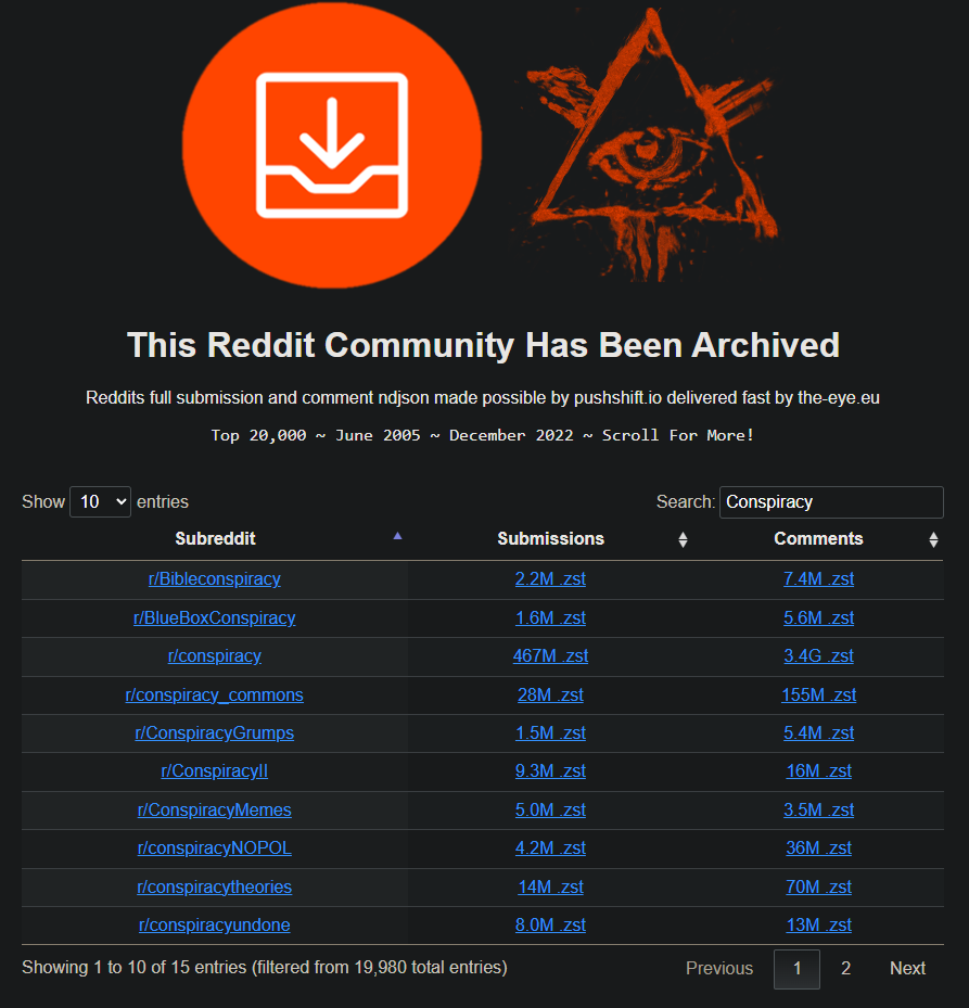
Using “The Eye”, a dataset containing posts and comments from the largest 20,000 subreddits over nearly two decades, I extracted all available content from these four communities. This corpus, covering years of claims, arguments, and reinterpretations serves as the raw material for constructing the conspiracy theory knowledge graph.
Harvesting the Data
With our ideal conspiracy theory map and data source defined, the next step is to acquire the data and prepare it for analysis. To do this, we navigate to the Reddit archive and manually download eight files: one file containing posts and another containing comments, for each of the four subreddits.
A screenshot from the archive.
These files are compressed, meaning their data structure has been altered to reduce file size. I wrote custom code (modified from the zreader utility, provided by the creators of the Reddit archive) to decompress the files and extract only the data we care about.
Because the source files are extremely large, the code must process them as a stream rather than decompressing them all at once. It works through each compressed Reddit file in chunks, decompressing a portion at a time, extracting the relevant values, and writing them to a new file. Attempting to decompress an entire file at once would exceed available memory and cause the process to fail.
For each post, the following values were extracted:
- title: The title of the post
- selftext: The text for the body of the post
- num_comments: The number of comments on the post
- ups: The number of upvotes
- downs: The number of downvotes
- score: The net score calculated as upvotes minus downvotes (i.e. ups - downs)
- created_utc: The timestamp the post was created, denoted in UTC
- permalink: The Reddit URL to the post
For each comment, the following values were extracted:
- author: The author of the comment
- body: The comment text
- ups: The number of upvotes
- downs: The number of downvotes
- score: The net score calculated as upvotes minus downvotes (i.e. ups - downs)
- created_utc: The timestamp the comment was created, denoted in UTC
Here is an example of a single post stored as a line in one of the output files:
{
"title": "What if BitCoin was created by the NSA for free computing power to decrypt anything ecnrypted [sic] with SHA-256?",
"body": "Or potentially some other kind of decryption capabilities?",
"number_of_comments": 4,
"upvotes": 11,
"downvotes": 0,
"score": 11,
"created": 1386335177,
"reddit_url": "https://www.reddit.com//r/conspiracytheories/comments/1s8n0r/what_if_bitcoin_was_created_by_the_nsa_for_free/"
}

A post from r/Conspiracy on Reddit. The title is in bold and the body describes in more detail the author's thoughts and evidence about their phone listening to them. In the bottom left you can see the total net number of votes. Upvotes and downvotes are not individually shown. The 768 comments will be contained in the "comments" file for this subreddit.
Our goal is to extract ideas from the text of these posts. That means there needs to be meaningful text present in the title, the body, or ideally, both. After reviewing the data files, I identified three cases where a post or comment should be removed from our text corpus:
- Comments made by AutoModerator, a bot that performs automated actions and is not part of the conspiracy theory discourse.
- Posts where the title and body are too short to convey a meaningful idea—for example, a post with the title “CIA” and the body “They are watching.”
- Posts or comments that have been deleted but remain archived in the dataset. These appear as "[deleted]" and contain no usable content.
A second set of code iterates through the decompressed data and removes any posts or comments that meet these criteria. Once this filtering step is complete, the remaining text is ready to be processed for extracting the “ideas” that will form our conspiracy graph.
Extracting Ideas
The next task is to extract ideas and relationships from the text so they can serve as the building blocks of our conspiracy graph. In natural language processing, this breaks down into two core tasks:
- Named Entity Recognition
- Relation Extraction
While the terminology sounds technical, the concepts themselves are fairly intuitive.
Named Entity Recognition (NER) refers to identifying words or phrases in a sentence that belong to a specific category, such as people, places, or organizations. For example, imagine we want to identify people in the following sentence:
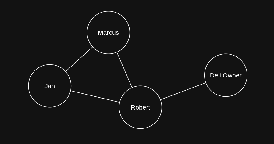
Jan and Marcus walked to the deli for lunch and were surprised to see their old coworker Robert talking to the deli owner there.
The named entities in this sentence are:
- "Jan"
- "Marcus"
- "Robert"
- "deli owner"
Relation Extraction (RE) builds on this by identifying how those named entities are connected. From the same sentence, we could extract the following relationships:
- "Jan", "accompanied by", "Marcus"
- "Jan", "old coworker", "Robert"
- "Marcus", "old coworker", "Robert"
- "Robert", "talking to", "deli owner"
Each of the items above is called a "triple". A single triple consists of a subject (or Head), a predicate (or relation), and an object (or tail). An example from above is:
- Subject: "Robert"
- Predicate: "talking to"
- Object: "deli owner"
If we used these triples to construct a graph, it would look something like this:
Named entity recognition and relation extraction are easy to grasp and fairly straightforward to perform by hand. The real challenge lies in doing them reliably, at scale, across millions of Reddit posts and within a realistic amount of time.
Thankfully, there is an open-source transformer model trained specifically for this task. Transformer models are a class of machine learning models. They share the same underlying architecture as ChatGPT, Claude, and other large language models. The term “transformer” refers to the mathematical framework that powers them, and it proves to be especially effective at language-centric tasks.
The YouTuber 3Blue1Brown has a phenomenal playlist on machine learning that walks you through the basics of machine learning, transformer models, attention, and the underlying mathematics. I've linked it at the bottom of this piece.
Researchers at Babelscape, the Italian tech company behind this model, trained a transformer to perform both named entity recognition and relation extraction. In simple terms, they fed the model a large volume of example sentences along with the correct entities and relationships, allowing it to learn how to extract them on its own, rather than requiring researchers to extract them manually.
The model isn’t perfect, and we’ll apply additional analytics and cleanup steps to refine its output. Still, it’s more than sufficient for extracting the ideas and relationships that underpin conspiracy theories.
The final constraint was time. I ran the model on an old gaming PC equipped with a powerful graphics processing unit (GPU). Modern machine learning libraries can leverage GPUs to run transformer models far faster than a standard CPU, and the difference is dramatic. After writing the necessary code, downloading the model, and letting it churn through millions of Reddit posts and comments (over the course of nearly a year), I finally had the building blocks of the conspiracy graph.
Grounding Knowledge in Reality
Now that we’ve extracted triples using the model, the next step is to evaluate their quality. Analytics are only as strong as the data behind them. If these triples don’t reflect reality, there’s little value in using them to build a knowledge graph.
Below are a few promising triples the model extracted directly from posts on the r/conspiracy subreddit:
- {"head": "Elon Musk", "type": "occupation", "tail": "agent of the system"}
- {"head": "London", "type": "capital of", "tail": "UK"}
- {"head": "Andrew Tate", "type": "employer", "tail": "CIA"}
- {"head": "WEF", "type": "field of work", "tail": "Human Enhancement"}
- {"head": "Klaus Schwab", "type": "employer", "tail": "BlackRock"}
Many of these results seem plausible for a conspiracy theory forum, but not all of the extracted triples are reliable. Below are a few examples that are confusing, unclear, or nonsensical:
- {"head": "bots", "type": "subclass of", "tail": "shills"}
- {"head": "sponsored", "type": "subclass of", "tail": "paid"}
- {"head": "conspiracy", "type": "different from", "tail": "believing"}
- {"head": "senile", "type": "said to be the same as", "tail": "decrepit"}
- {"head": "2", "type": "followed by", "tail": "3"}
These triples are harder to interpret. While it’s possible to see how the model arrived at them, they are unlikely to contribute meaningfully to the knowledge graph. As a result, we need a way to filter out low-quality or ambiguous extractions.
One effective way to improve the reliability of machine learning outputs is to ground them in structured, human-curated knowledge. To do this, I chose to use Wikidata, a free, open, collaborative knowledge base. It contains structured data about real-world entities that serves as the central data hub for Wikipedia and other Wikimedia projects.
We can take each extracted triple and attempt to match its subject and object to corresponding Wikidata entities. If both return a sufficiently close match, we replace the LLM-generated entities with their Wikidata counterparts. This approach serves multiple purposes.
First, it helps remove incoherent or ambiguous entities produced by the model. For example, the model extracted "his right earlobe" as a triple subject from a post on r/conspiracy discussing the "Single-bullet Theory" of the JFK assassination. This kind of entity isn’t meaningful for a knowledge graph, and since it cannot be linked to any concrete Wikidata entry, it is filtered out.
Second, it allows us to standardize entity names across triples. Different mentions such as "CIA", "Central Intelligence Agency", or "The Agency" all refer to the same organization. By mapping them to the same canonical Wikidata entity, we ensure consistency and make the resulting knowledge graph much more reliable and easier to analyze.

Wikidata results for "his right earlobe". No results means it will be dropped from the knowledge graph.
But what happens when a result is close, but not an exact match? For instance, the model frequently extracts “J.F.K.”. How do we know it refers to the president rather than something else?
The challenge is compounded by ambiguity: “J.F.K.” could refer to the former president, an airport, a movie, an assassination, or other ideas. Our task is to reliably select the correct entity across millions of examples, a scale that makes simple string matching insufficient.
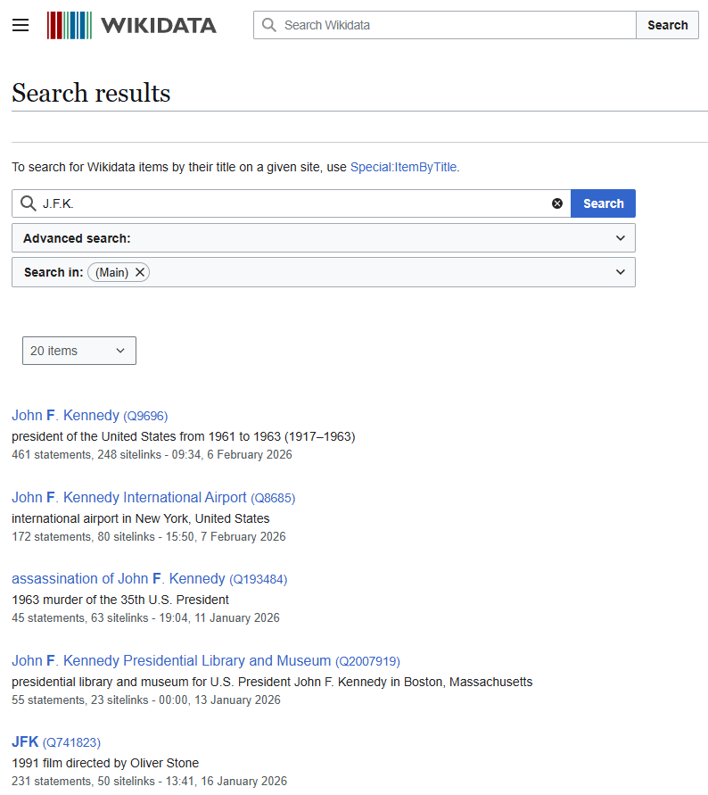
Wikidata results for "J.F.K.".
We can handle this problem with a simple process for searching Wikidata:
First, we search for the subject of a triple on Wikidata. We look through the results and pick the one that is most similar. If it’s a close enough match, we use the Wikidata entry; if not, we discard the triple. We repeat the same process for the object.
To do this at scale, we write code that automatically performs these searches across millions of triples. Because Wikidata doesn’t allow automated scraping, the code mimics a human using a web browser, appearing to Wikidata as normal browsing traffic.
The code uses Levenshtein distance to measure how similar each result is to our original term. This method counts the minimum number of single-character edits needed to transform one string into another. The allowed edits are:
- inserting a character
- deleting a character
- replacing a character
To see how this works in practice, consider the words "cat" and "cut". To turn "cat" into "cut", we replace the letter a with u. This gives a Levenshtein distance of 1.
Now take the words "book" and "back". Here, we need to replace the first o with a and the second o with c, resulting in two edits. The Levenshtein distance in this case is 2.
Intuitively, a distance of 0 means the strings are identical, a small distance indicates the strings are very similar, and a large distance shows they are quite different.
For each Wikidata search, the script calculates the Levenshtein distance for all results and chooses the most similar entry. The similarity score is then converted to a simple scale from 0 to 100, where 0 means completely different and 100 means an exact match. If the best match scores above a set threshold, such as 70, we accept it as a valid match and move on to the next search.
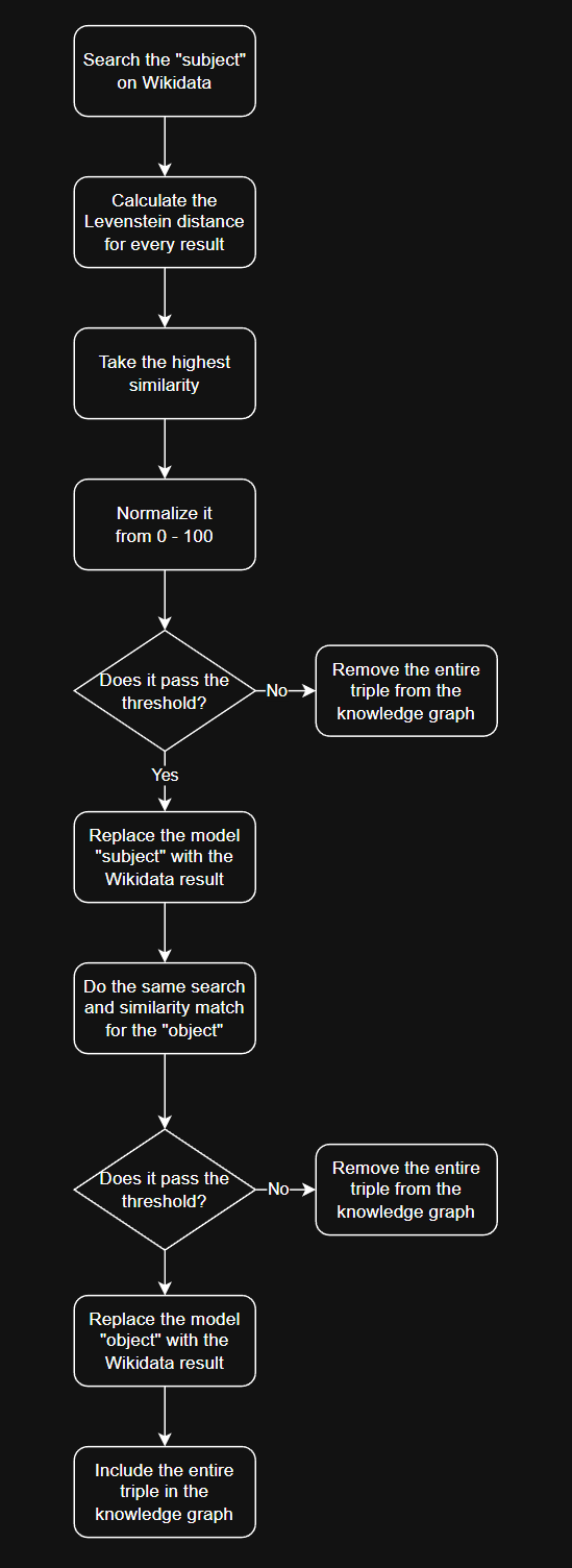
The entire process described above, represented as a process map.
With the above process finished, we now have the means to construct the final graph.
Cartography Meets Psychology
Graph construction begins by combining all entities and edges to assemble the network. While we will walk through a simplified example here, the actual process operates on a much larger scale.
The first step in the process is to remove self-referencing entities. For instance, if the node "Elon Musk" is connected to itself, that connection is discarded. Self-references can be meaningful in some graphs. For example, in a protein regulation network, a protein that regulates itself (known as autoregulation) should be preserved. In our graph, however, self-references are removed because they do not provide additional insight.
The second step is to define the “strength” of the relationship between entities. For example, if the entities "Russia" and "China" appear together in the graph, how closely are they related? To quantify this, we count all occurrences of each distinct node pair, treating the order of nodes as irrelevant (so "CIA" connected to "Osama Bin Laden" is treated identically to "Osama Bin Laden" connected to "CIA"). This yields a raw count that represents the relationship’s strength.
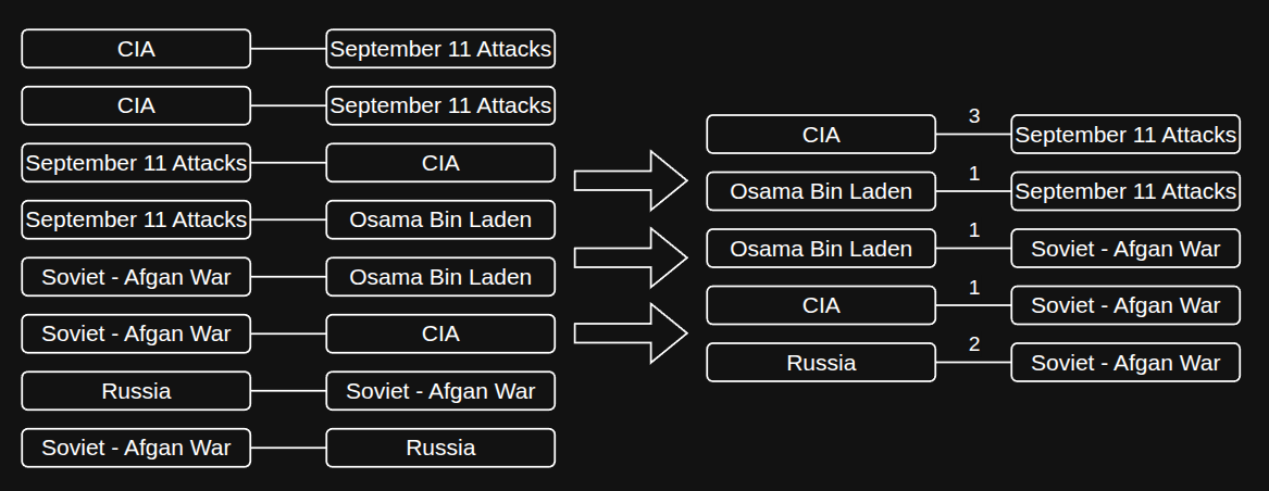
Visualization of the second step in the graph creation process, where numerical edge strengths are calulated.
It is important to remember that each extracted node pair reflects a co-occurrence in a sentence or paragraph. The principle here is that the more frequently two concepts are mentioned together, the stronger their conceptual link. This count is stored as an integer representing the connection's weight.
The third step is to normalize the edge strengths. Raw values like 40, 592, or 5,020 are difficult to interpret on their own, so we convert them to a scale between 0 and 1 using min-max normalization. This method rescales all values based on the minimum and maximum in the dataset, so the smallest value becomes 0, the largest becomes 1, and everything else is proportionally adjusted in between. This transformation makes the data more comparable and easier to reason about across the entire network.
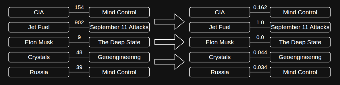
Visualization of the third step in the graph creation process. Normalized values are shown on the right, where the smallest value in the set is 0, and the largest value is 1.
Normalization gives us an intuitive sense of connection strength. For example, a normalized value of 0.92 clearly indicates a strong relationship and 0.03 indicates a weak one. Whereas raw counts like 205 or 6,000 are much harder to contextualize. Since our knowledge graph incorporates millions of posts, comments, and extracted entities, this step is important for making the network readable and for highlighting which relationships are truly significant.
The fourth step is to prune the graph by applying a “cutoff” threshold that removes a defined percent of relationships based on their normalized strength. This focuses the analysis on the most meaningful connections.
The first reason for pruning is to eliminate low-strength relationships, which contribute little signal to the analysis. These weak connections don't improve our understanding of the network’s structure and can obscure the more significant relationships. The second reason is computational efficiency. Without pruning, the graph contains over 260,000 nodes and more than 1.4 million edges, requiring substantial memory and processing power. By removing weaker edges, we reduce these demands, making the subsequent analysis feasible on standard hardware.
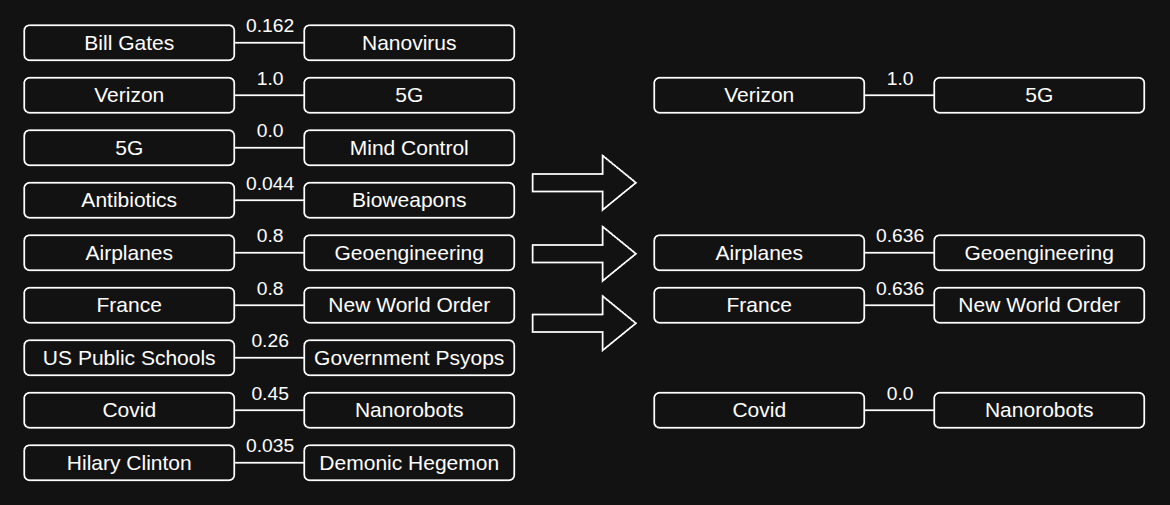
Visualization of the fourth step using a threshold of .40. All pairs less than this are dropped, and the node pairs on the right are renormalized again.
After applying the cutoff threshold, we remove the low-strength nodes and edges, then renormalize the remaining graph. For example, if the threshold is set at 0.4, all pairs with a strength below 0.4 are removed, and the remaining edge strengths are rescaled so that 0.4 now maps to 0, as in the earlier normalization step.
To keep the graph meaningful, I applied an aggressive filtering threshold, retaining only the top 2% of connections by strength. The connection weights followed a long-tail distribution, where the vast majority of edges added noise. After experimenting with different thresholds, it was clear that the top 2% consistently captured the bulk of the meaningful relationships while stripping away the clutter. With the nodes and edges finalized, the graph was ready.
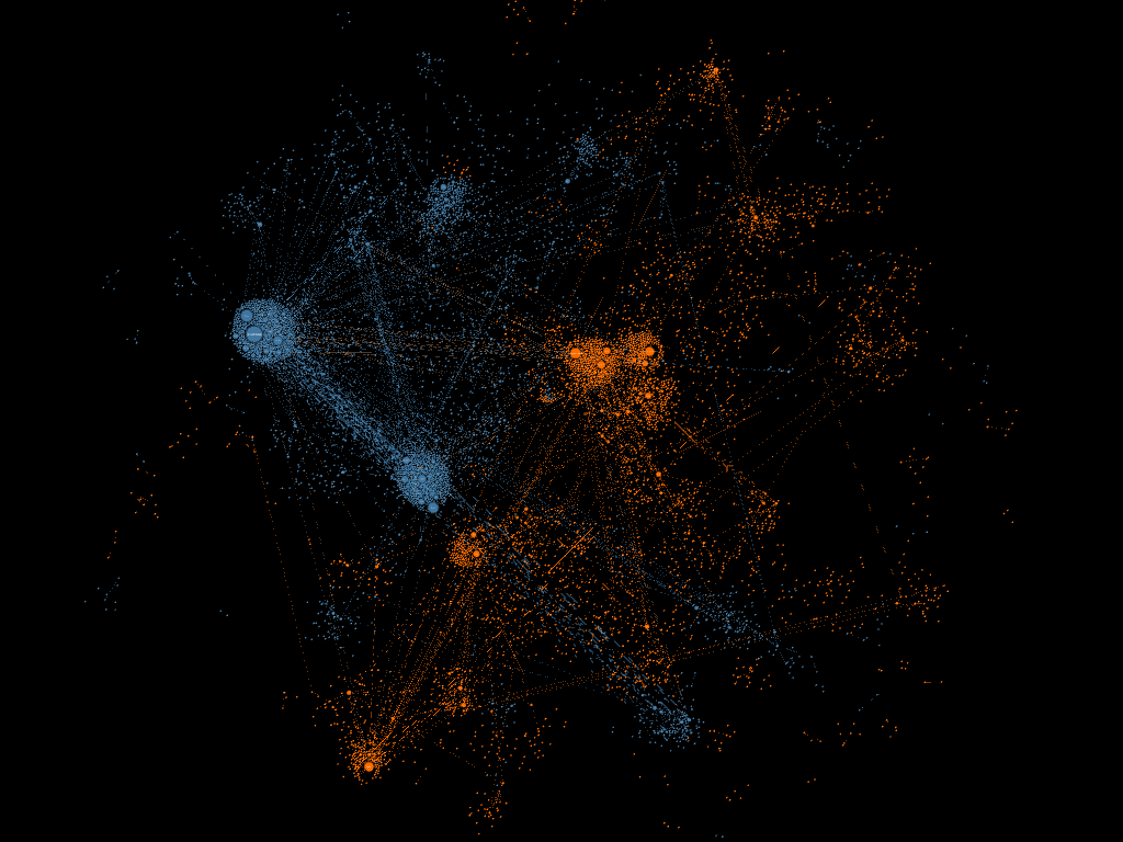
Analysis of a Collective Conciousness
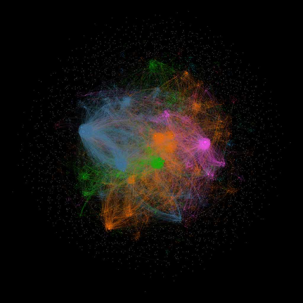
The final graph, fully rendered.
With the graph built, the real work could begin. Before diving into any analysis, I needed to do some housekeeping: organizing the graph visually, grouping related ideas together, and calculating a few key statistics that would come in handy later.
First up was the layout. Raw graph data is just a jumble of dots and lines, so I used a couple of specialized layout algorithms (OpenORD and ForceAtlas2) to bring some order. Think of these like a physics simulation: nodes that are heavily connected get pulled toward each other, while unrelated ones drift apart. The result is the clustered, almost galaxy-like layout you see above, where proximity actually means something.
Next, I needed to identify the distinct clusters hiding within all those connections. For this, I used the Louvain algorithm, a popular method for detecting clusters in large networks. The algorithm looks at the web of connections and asks: which nodes are talking to each other more than they're talking to everyone else? The answer becomes a distinct cluster.
Finally, I calculated a set of metrics to give the analysis some grounding. Things like weighted degree (how many connections a node has, and how strong they are), eigenvector centrality (a measure of influence, not just how connected something is, but whether it's connected to other highly connected things), and some overall graph density metrics (how tightly knit the network is as a whole). These numbers help with some of the analysis later on.
What are the most important ideas?
The first question felt like an obvious place to start: What ideas actually matter most in this network?
Setting the clusters aside for a moment, I ranked every node by importance using a combination of the two influence metrics calculated earlier: weighted degree and eigenvector centrality. Together, these give a more complete picture than either measure alone: not just how connected an idea is, but how connected to other well-connected ideas it is. The top 10 most central ideas in the entire graph:
- Russia
- JFK
- Israel
- Donald Trump
- The United States of America
- The September 11th Attacks
- The US President
- The Democratic Party
- China
- Ukraine
Shocking? Not really. If you've spent any time in the darker corners of the internet, this list probably looks exactly like what you'd expect. These are some of the heavyweights of online conspiracy culture. They're topics that show up everywhere, connect to everything, and never seem to go away. That said, we're only answering the most surface-level question here. Knowing what's popular is just a starting point.
What are the clusters?
Next, I looked at the clusters. I focused on the five largest clusters, because they accounted for over 80% of the nodes.
Cluster 1 - Geopolitical Control
Node Percentage: 30.6%
Core Ideas: Russia, Israel, The United States Of America, WW2, Zionism, Europe, The US Dollar, Iraq
The largest cluster, making up nearly a third of the entire graph, revolves around geopolitical control. The central thesis connecting these ideas is a familiar one in conspiracy circles: powerful nation-states are being used to manipulate society on a global scale.
There are three key themes within the cluster. First, most large, powerful countries are mentioned (like the US, Russia, China, among others). Second, there are many geopolitical events, like the World Wars, the invasion of Iraq and and the Benghazi attacks. Lastly, there are references to ethnic and national groups: Americans, Jews, Muslims, Europeans, Canadians, African-Americans, Christians, etc.
Cluster 2 - Surveillance and Propaganda
Node Percentage: 28.85%
Core Ideas: 9/11, Google, The Central Intelligence Agency, The National Security Agency, Propaganda, The Federal Bureau of Investigation, The Internet, Social Media, Facebook, Mass Media
The second largest cluster centers around the control of information. Like the first cluster, it can be broken down into three distinct themes.
The first is intelligence agencies. The CIA, NSA, and FBI are all prominent nodes here, and they're joined by several foreign agencies. The second theme is media manipulation. Sandy Hook appears frequently, alongside mainstream outlets like CNN and Fox News. The third theme is the internet itself. Facebook, Google, Twitter, and social media appear, as do internet origins like the US Navy and DARPA.
Cluster 3 - Medical and Pharmaceutical Control
Node Percentage: 13.76%
Core Ideas: Vaccines, COVID-19, Monsanto, Pfizer, Influenza, Pandemics, Bill Gates, Disease, The CDC, HIV, The Food and Drug Administration, AIDS, Autism, WHO
After the first two clusters, the size drops off noticeably, but 13.76% of the graph is still a significant portion. This cluster centers around medicine, vaccines, and the institutions that oversee them.
COVID-19 is the obvious center of gravity here, but the ideas are broader than just the pandemic. Large pharmaceutical companies like Pfizer and Monsanto are mentioned, alongside the government bodies meant to regulate them (The CDC, FDA, and WHO). Bill Gates appears as a prominent node as well, likely a reflection of how thoroughly his name has become associated with with vaccine conspiracy theories in recent years.
Older conspiracy theories show up too. HIV, AIDS, and the long-running claim that vaccines cause autism are all included.
Cluster 4 - US Politics
Node Percentage: 7.91%
Core Ideas: Donald Trump, JFK, President, The Democratic Party, The Republican Party, Hillary Clinton, Barack Obama, George W. Bush, The 2016 Election, Bernie Sanders
The fourth cluster is distinctly American and spans US political history from the late 1950s to the present day. JFK and his assassination lead the pack. Bush, Obama, Biden, Trump, both Clintons, and the 2016 election are all mentioned as well.
Cluster 5 - Celebrities and Pop Culture
Node Percentage: 1.27%
Core Ideas: The Great Gatsby, Glee, Kanye West, The Beatles, The Simpsons, Beyoncé, Jay-Z, David Bowie, John Lennon, Kim Kardashian, The Rolling Stones
The smallest cluster by a wide margin, this one pulls together celebrities, bands, and pop culture. This cluster was something of an outlier.
The cluster consists mostly of celebrities and bands, like The Beatles, The Rolling Stones, David Bowie, Kanye West, etc. Occasionally a book or movie will crop up. Most surprising of all is The Great Gatsby. This was the most important idea in the cluster. I'm still not sure what to make of it.
Cross Cluster Analysis
With the individual clusters mapped out, the next natural question was: how do these groups relate to one another?
To explore this, I filtered the graph down to the two largest clusters and stripped out lower-weight edges to focus on the most meaningful connections. Looking at "Geopolitical Control" and "Surveillance and Propaganda" side by side revealed two smaller "sub-clusters" from each that bridge the connections between the two larger clusters.
The "Geopolitical Control" sub-cluster is dominated by the US and Israel nodes. The "Surveillance and Propaganda" sub-cluster contains references to conspiracy theories, intelligence agencies, and specific instances of perceived propaganda.
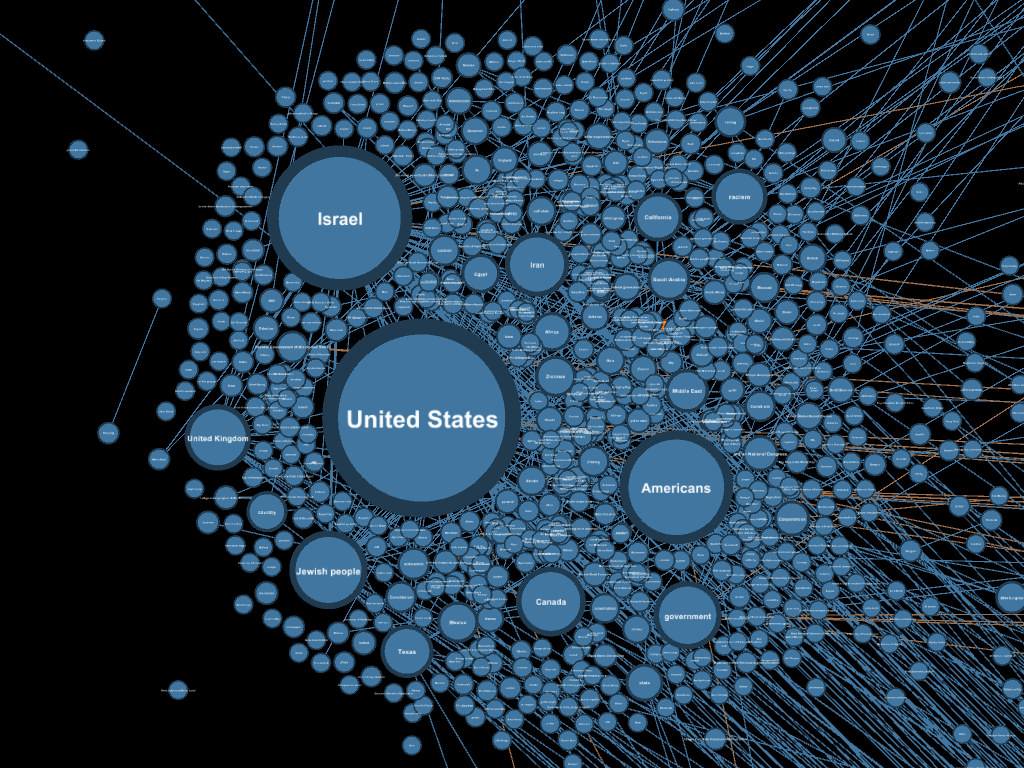
The sub-cluster within the large "Geopolitical Control" cluster that contains many connections to the "Surveillance and Propaganda" cluster (these appear as faint orange lines on the right side of the image).
The glue holding the two clusters together is governments and intelligence agencies. It makes sense: intelligence agencies are fundamentally in the business of information, and they operate within nation-states. This is not exactly a groundbreaking observation on its own, but there's something striking about seeing it emerge organically as a digital structure of interconnected ideas.
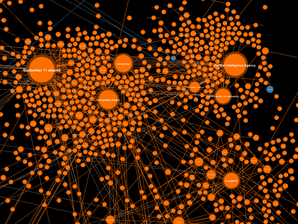
The sub-cluster within the large "Surveillance and Propaganda" cluster that contains many connections to the "Geopolitical Control" cluster (these appear as faint, blue lines in the top left of the image).
Open Questions and Future Work
This analysis only scratches the surface of what the graph has to offer. One promising direction would be K-core decomposition, a technique that peels away the least connected ideas, layer by layer, until only the most densely interconnected nodes remain. This could be used instead of filtering by edge weight globally, and could reveal the ideological core of the network through a more structurally meaningful lens.
It would also be worth examining the overlap between all of the major clusters rather than just the two largest. For example, the bridge ideas connecting the "Medical and Pharmaceutical Control" cluster to the "Celebrities and Pop Culture" cluster could yield surprising findings.
Finally, an interesting alternative to the Louvain clustering used here would be applying the LDA algorithm to the posts and comments. The topics identified could then serve as classifiers, enabling analysis of how different conspiracy theories emerge and decline in prominence over time.
Our Voyage Concludes
So what does it all mean?
After two years of running Python scripts, sifting through data, and manually reviewing thousands of conspiracy theory posts on Reddit, I've arrived at the conclusion that conspiracy theorists aren't fundamentally different from the rest of us.
Simon DeDeo describes conspiracy theories as explanations that over-index on one specific attribute. One attribute is simplicity, the idea that the best explanation is usually the most concise one. Another is explanatory power, the ability for a single theory (however complex) to account for as much of the world as possible. Who doesn't like a simple explanation that makes the world feel more coherent? A single, shadowy, cabal controlling the world is an extraordinarily simple and far-reaching explanation.
After reading countless posts and even interacting directly with many of their authors, what struck me most wasn't the strangeness of their beliefs but the familiarity of their underlying concerns. They wanted to feel safe, they wanted autonomy over their own lives, and most of all, they wanted to know the truth. These are values I recognize in almost everyone I've ever met, myself included. The difference lies not in the values themselves but in the ways they manifest in our worldview.
If you step back far enough, the graph stops looking like a map of conspiracy theories altogether. In a lot of ways it actually represents a map of human anxieties, confusion, sense making and the global information systems we've built to share them with each other. If any of this has resonated, I've included the materials, methods, and ideas that shaped this project in the "learn more" section below. I hope it was worth your time. It certainly was worth mine.
Learn More
- Dietrich Deep Dives: The Psychology of Conspiracy Theories
- Mindscape 150 | Simon DeDeo
- Pushshift Reddit Archives
- Pushshift Github
- REBEL: Relation Extraction by End-to-End Language Generation
- 3Blue1Brown: Machine Learning
- Jay Alammar: The Illustrated Transformer
- Gephi - Introduction to Network Analysis and Visualization
- Github: afristo/conspiracy-graph